
Abegoa Soap Rebranding
BRANDING IDENTITY & ALL COLLATERAL
Abegoa is a local, organic olive oil soap company located in Abegoa, Portugal that I stumbled upon while researching a company to rebrand for a college project. They only use pure local olive oil and hand cut each bar of soap they manufacture. With a "farmer's market" feel, the words "quality", "local" and "gentleness" associated with this brand is what inspired the overall brand strategy. It was appropriate to upscale a quality product for how much care and thought that is put into it through the use of advertising, improved website and packaging, and merchandise.
My Role:
Package Design, Concept, Logo Design, Web Design,
Print Design, Marketing Collateral, Packaging Photography
Animation by: Jessica Stafford
Logo
The redesign of the Abegoa logo combines the feeling of joy using an abstract figure and leaves to keep an "organic" feel but convey what the customer should feel while using the product.
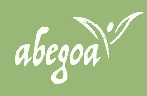
For displayed purposes, the brand mark should only be shown white on a green background.


Website Design
Abegoa Home Index Page
Abegoa Product Page
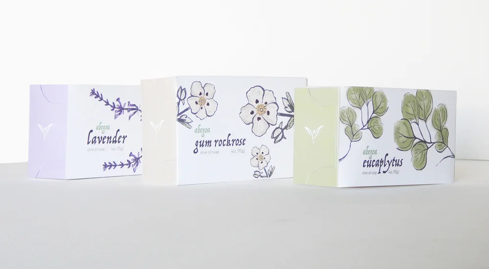
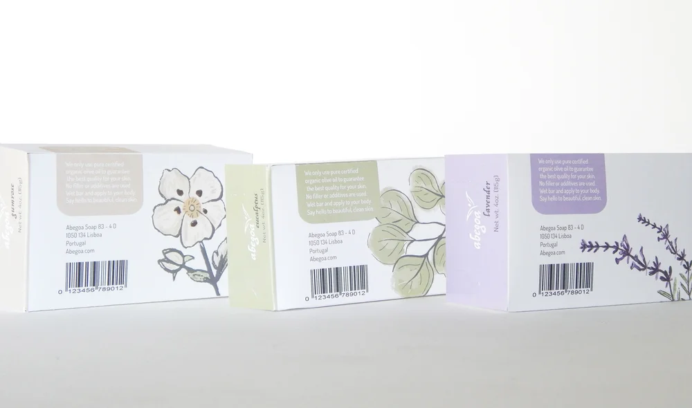
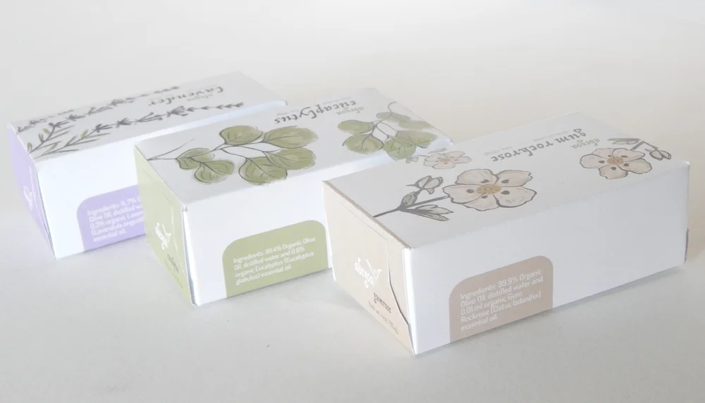
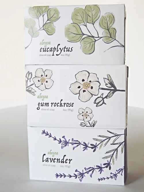
Packaging Design
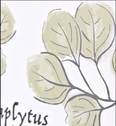
Inspiration for Abegoa's soap packaging was the textural mark, which utilizes original hand-rendered illustrations, while speaking to the local, natural feel the brand originally has.

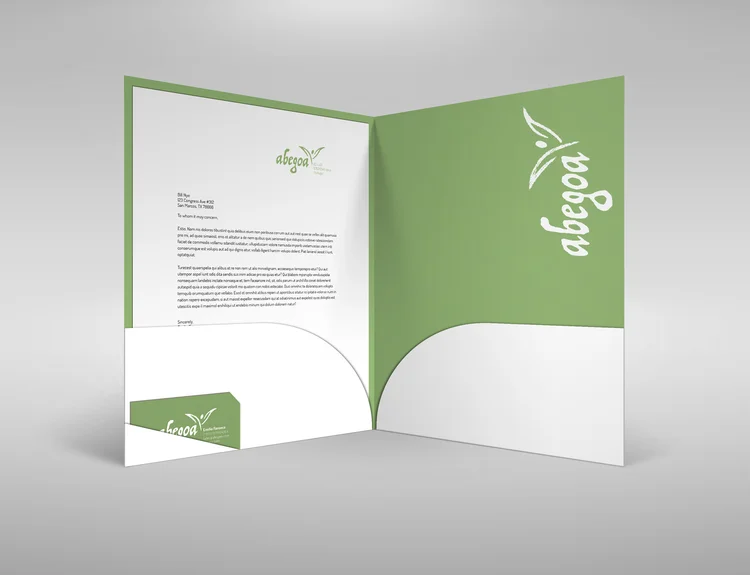
Merchandise & Advertising
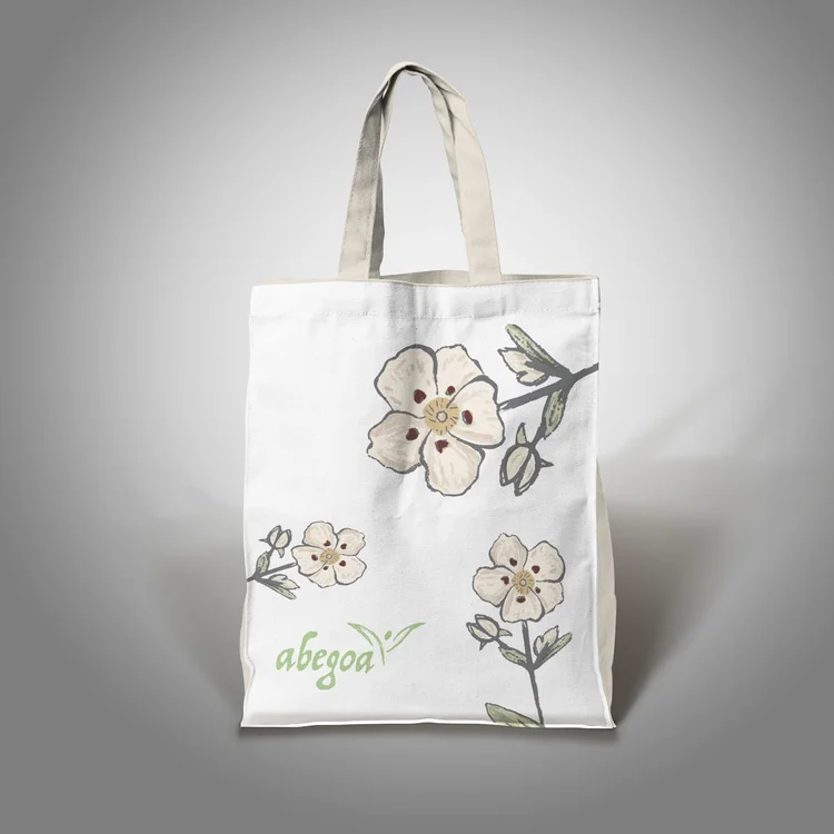
Since Abegoa doesn't have a store front and sells mainly online, designing a sign helps visualize this brand's future. The cotton bags also allow consumers to enjoy a handmade bag, while promoting a handmade product and it's visually fun enough for everyday use. The inspiration of the advertisement was the company's use of olive oil and their research of it improving skin. "Because you love your skin" promotes the fact people deserve the best quality for their bodies by using this quality product.